Naturally, the mobile web has always lived with certain constraints. Small screens, touch input, flaky networks, and a wide device matrix force trade-offs rarely present when developing for desktop browsers. Yet in 2026, many of the sharpest edges are not universal mobile problems. They typically cluster around one place: iOS Safari, and by extension every browser on iOS.
Given the market share of iOS devices, particularly in key, high-income markets, Apple plays a significant role in shaping what is possible on the mobile web. This kind of power is not new. Apple’s refusal to support Flash more than 15 years ago accelerated its collapse and changed the direction of the web forever. On mobile today, a similar pattern exists, just less visible and more subtle.
The Pursuit of Native-Like Web Experiences
This article is not about Progressive Web Apps—an actually profoundly related topic whose trajectory briefly echoed Flash’s fate; and while Apple reversed its decision to kill PWAs in the EU in early 2024, that reversal is far from the end of the story, given continued lack of enthusiasm for PWAs by Apple as well as other players.
Instead, I want to focus on the unique layout and rendering challenges in iOS Safari when trying to give web apps a truly native look and feel. A couple things come to mind:
- fullscreen layouts
- fixed elements
- snap-scrolling
- modals
Are those things are nothing too special really and are or should be achievable on all modern platforms. So what could possibly go wrong?
<div class="h-screen">
    What could possibly go wrong?
</div>
The viewport height and iOS 26
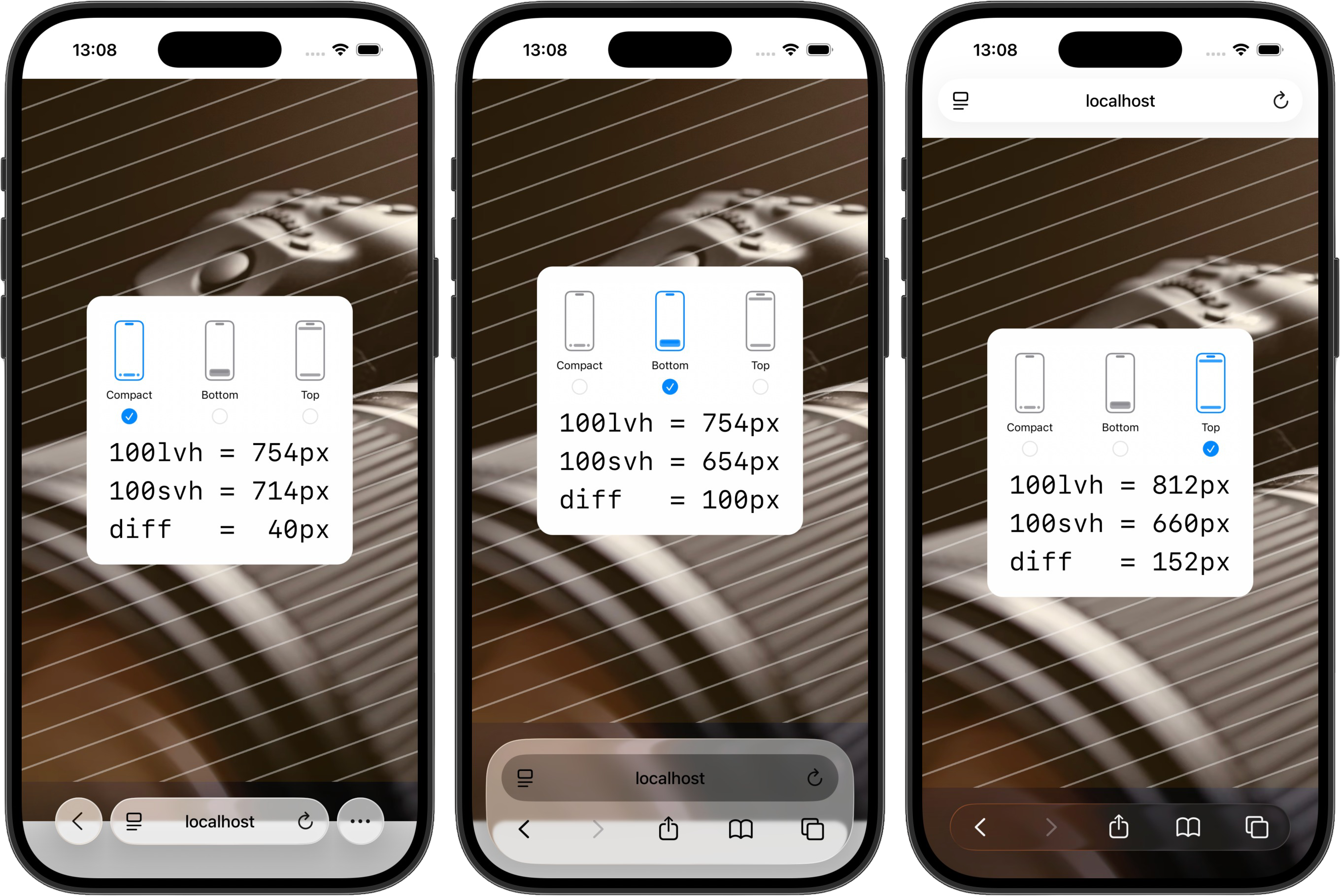
Since mobile browsers introduced auto-collapsing UI, 100vh has been unreliable for representing the actual viewport height. Large and small viewport units improved the situation. I’m intentionally omitting dynamic viewport units here, as they’re typically unusable in practice due to layout shifts. One pattern has been to use 100lvh for the section (and its background) and 100svh for the content. Prior to Safari 26/Liquid Glass this was a widely supported solution.
Safari’s new viewport model allows content to expand to the physical display edge, but this full innerHeight is not exposed as a CSS unit. On top of that, Safari now has three layout settings, and in the commonly used compact and bottom modes, 100lvh extends only partially behind the browser UI. The result is visually awkward, especially for high-contrast sections, and achieving a clean fullscreen appearance is now effectively impossible without hacks.

Fixed and sticky elements
Historically, there have been several bugs (or features?) on iOS that made elements with position: fixed not behave reliably.
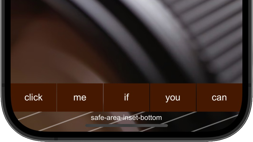
Fixed bottom navigation is a very common and ergonomic pattern in native mobile apps. The persistence of the single-tab mode (address bar at the top) up through Safari 18 made it nearly impossible to properly implement this kind of navigation on the web, with touch events near the bottom of the viewport being intercepted by system UI.

Nope, safe-area-inset-bottom does not solve the issue. The lower part of the nav buttons is obstructed by an invisible touch-sensitive area claimed by Safari's system UI.
Futhermore, whenever the screen keyboard is open, fixed elements can be accidentally scrolled out the viewport on mobile Safari, requiring additional workarounds to avoid such behaviour.
Safari 26 introduces new challenges, particularly around sticky elements. While Safari automatically disables edge-to-edge rendering when it detects fixed headers or footers, sticky elements complicate this behavior: the UI must enable edge-to-edge rendering conditionally, which typically results in visual glitches, especially since you cannot directly control the browser's theme-color anymore.
Snap scrolling
The essence of this chapter can be distilled into:
Don't use native (CSS) page-level snap scrolling
The full story?
First of all, I'd recommend to avoid JS solutions like fullPage.js as well, they have other important downsides. In other words, don't bother with page-level snap scrolling. For horizontal scrolling of carousel-like components it can make sense though, as showcased on the work section of my website.
Fundamentally, the absence of a consistent and reliable viewport height, as discussed above, combined with the lack of cross-platform control over scroll behavior, severely limits the viability of CSS snap scrolling on the mobile web. Safari on iOS further exacerbates these issues by introducing additional unexpected behaviors, such as restoring the scroll position when returning to a page that uses snap scrolling.
Modals
A longstanding Safari issue is the inability to properly lock the scroll position of a page without side effects. Even Apple’s own solution, while effective at preventing scroll, relies on setting the body height to 100%, which comes with a variety of side-effects:
- the page scrolls up top the beginning and the original scroll positon is lost
- consequently, the address bar jumps back in
- overlays that partially cover the viewport or have alpha transparency don't play nicely with this approach
- nor does fading in the overlay (Apple actually does it anyway)
/* scroll-lock on apple.com */
html.globalnav-noscroll,
html.globalnav-noscroll body {
    overflow: hidden !important;
    position: relative;
    height: 100% !important;
}
As of January 2026, you can observe this behaviour on apple.com by opening the main menu or search after scrolling down the page.
ScrollY is reset before the modal overlay fades in. The transition is slowed down to better illustrate the issue, however the glitch is visible in real life as well.
Incentives and Open Questions
Apple takes a commission on all purchases made through native iOS apps, creating a substantial revenue stream that could be undermined if web apps became functionally equivalent. While the issues documented above could simply reflect prioritization decisions or technical challenges unique to Safari's architecture, some indicators suggest otherwise: third-party iOS browsers handle certain scenarios more gracefully (others less so), and bugs specifically affecting app-like experiences have persisted for years despite active developer feedback. Whether intentional or not, the incentive structure does not strongly favor making the mobile web as capable as native apps.
Progress, Despite Everything
That said, Safari's trajectory over recent years has clearly shifted. WebKit now ships modern CSS features at an improved pace, including container queries, :has() selectors, and scroll-driven animations. While Apple notably took nearly a decade to integrate the Google-developed WebP image format into it's operating systems, AVIF support landed much quicker and Safari is the only browser shipping JPEG XL support as of January 2026.
Although Safari has closed gaps in many core platform capabilities, one structural constraint keeps limiting deployment speed: Safari updates are tied to OS releases, unlike Chrome on Android. Yet the underlying pace and direction of WebKit development now suggest sustained, meaningful progress, even if the gap between web and native experiences on iOS remains wider than it needs to be.